Instagram Unveils New Wordmark, Sparking Immediate Design Criticism
Adam Mosseri describes the shift as a modern refresh, but users and media outlets highlight inconsistent lettering and aesthetic jarring.
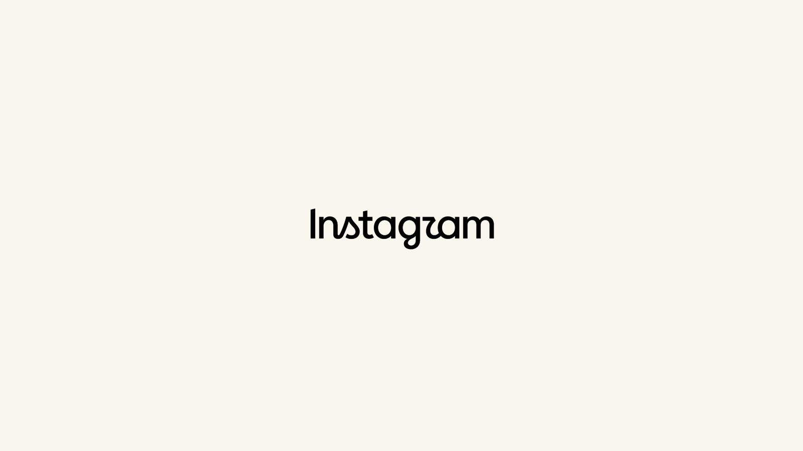
Adam Mosseri, head of Instagram, has revealed a new wordmark for the platform, describing the change as a cleaner and more modern refresh of the brand’s visual identity. The announcement marks the first significant alteration to Instagram’s logo in ten years, replacing the script font that has defined the platform’s aesthetic since 2016.
The new design blends cursive and sans-serif elements, creating a hybrid typeface that has drawn immediate confusion and criticism from users. The update signals a deliberate shift in branding strategy for the social media giant, which previously moved from its original brown camera icon to a colourful pink gradient in 2016.
Public reaction has been swift, with many mocking the inconsistent letter connections and the overall aesthetic. The Engadget article inviting users to critique the design highlighted specific design quirks, noting the sharp termination of curves and the inconsistent connection between letters.
Commentators pointed out that the consecutive "t" and "a" stand out prominently, with some interpreting the visual arrangement in unintended ways. Others noted a disturbing, semi-connected "r" and questioned whether the bottom of the "g" flowed correctly, with some users commenting that the logo resembled "Instagzam".
While the design has been described by some as potentially "corporate ragebait", this interpretation reflects reader sentiment rather than confirmed intent from Meta. Industry observers view the reintroduction of a new logo as a strategic move, though the immediate reception suggests the hybrid approach may not be resonating with the user base.
The shift away from the recognisable script font that has been in place for a decade represents a major departure for the platform. As users and media outlets continue to dissect the new wordmark, the design remains a subject of debate regarding its clarity and modern appeal.
The platform’s reliance on its previous visual identity for ten years meant that any change would be closely scrutinised. The mixed response to the new logo underscores the challenges social media companies face when attempting to modernise established brand assets without alienating their core audience.