Instagram Unveils First Branding Refresh in a Decade
Adam Mosseri says the new wordmark is cleaner and more modern, but initial observers note the shift to a half-cursive, half-print style may reduce legibility.
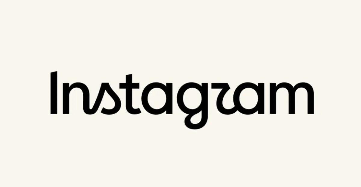
Instagram has introduced a new wordmark, marking the first significant alteration to its visual identity in ten years. The update replaces the platform’s long-standing cursive typeface with a hybrid design that combines half-cursive and half-print elements. The change signals a deliberate shift in branding strategy for the social media giant, which has relied on its recognisable script font since 2016.
Adam Mosseri, head of Instagram, announced the refresh on his official account, stating that the existing wordmark had not changed in a decade and required an update. Mosseri described the new design as cleaner and more modern, emphasising that it retains references to the original aesthetic while prioritising simplicity and craft. The announcement was made on 13 August 2026, following the publication of details by The Verge.
The new typography has drawn immediate scrutiny regarding its readability. Initial observations suggest the hybrid style is less legible than the previous version, with some viewers noting that the altered letterforms could lead to misinterpretations, such as reading the brand name as “Instagzam”. This subjective reception highlights the risks associated with rebranding established digital assets.
While the design changes are primarily aesthetic, they reflect broader trends in digital branding where platforms seek to modernise their visual language. The decision to move away from a purely cursive font suggests Instagram is aiming for a more versatile identity that may perform better across various digital interfaces and contexts.
The reaction to the new wordmark remains mixed, with some observers appreciating the nod to the original design while others question the practical implications of the reduced legibility. As the new branding rolls out, it will be interesting to see how users and advertisers adapt to the updated visual identity.