Roku reworks homescreen to balance late-adopter simplicity with ad revenue
The new interface marks a strategic pivot for the company, which has surpassed 100 million households by prioritising hardware margins and ease of use over design innovation.
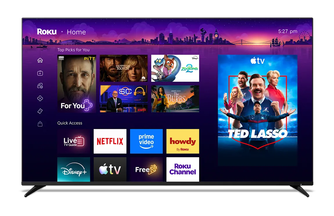
Roku has initiated a rollout of a redesigned homescreen interface for its streaming devices, marking the first significant departure from its longstanding app-icon layout. The update introduces a content-forward design featuring a personalised "top picks for you" section, a dedicated "quick access" area for frequently used applications, and a new "Your Daily Scoop" feature that leverages large language models to provide zeitgeist-based recommendations. This shift aligns the platform with industry standards set by competitors such as Amazon and Google, while attempting to retain the simplicity that has driven its adoption among late adopters.
The redesign aims to simplify navigation for users who may not be tech-savvy, a demographic that has historically contributed to Roku’s success. Preston Smalley, Roku’s vice-president of viewer product, noted that the company’s strategy has long focused on budget-friendly pricing and hardware profit margins rather than design innovation. By incorporating a "quick access" section that auto-updates based on usage, the interface allows users to launch favourite apps or switch HDMI ports with minimal effort, addressing the needs of households where device configuration is often managed by family members.
A key differentiator in the new interface is the "Your Daily Scoop" feature, which uses third-party data and large language models to curate suggestions based on awards, holidays, and pop culture moments. Smalley indicated that the system includes specific guardrails to exclude sensitive topics such as war, ensuring a curated experience. This approach attempts to compensate for Roku’s lack of first-party data sources, such as search trends or voice assistant usage patterns, which competitors like Google and Amazon utilise to personalise their content discovery.
The update also places a stronger emphasis on monetisation and engagement through "Roku City," the company’s interactive screen saver. The new homescreen includes a dedicated icon for the screen saver, which has been expanded to feature ad campaigns, minigames, and live concerts. Executives are exploring the potential to bring "Roku City" to the company’s mobile app, which currently boasts 34 million monthly active users, signalling a broader strategy to integrate advertising opportunities across all user touchpoints.
While the new interface introduces more visual elements than previous versions, it retains a familiar grid layout that avoids the large hero art and autoplay trailers common on rival platforms. This design choice reflects Roku’s historical focus on creating a less distracting user experience, ensuring that existing customers feel at home while the platform competes more aggressively for attention and advertising revenue in a crowded streaming market.