Microsoft strips colour from Copilot in push for professional restraint
The Microsoft 365 version of the AI assistant adopts a black-and-white, text-forward design to improve readability, marking a strategic shift away from the colourful consumer app and deeper reliance on OpenAI.
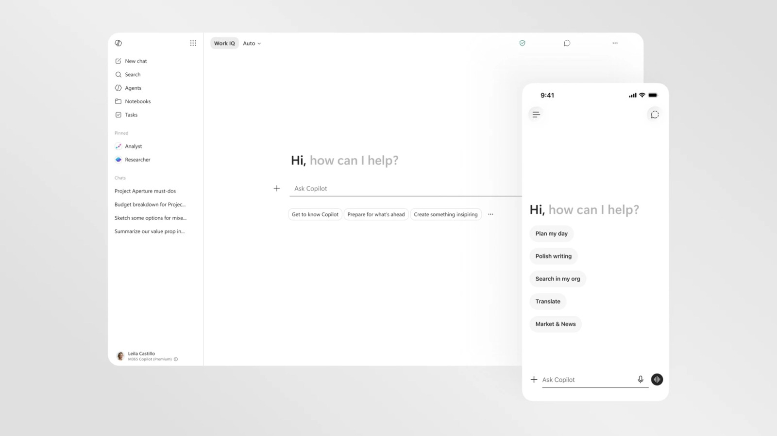
Microsoft has introduced a significant visual overhaul for the Microsoft 365 version of its Copilot AI assistant, shifting the interface to a largely black and white, text-forward aesthetic. The redesign aims to improve readability and consistency across productivity applications such as Word, PowerPoint, and Excel, reflecting a broader corporate strategy to refine how artificial intelligence integrates into professional workflows.
The most striking change is the removal of vibrant colours from the default interface. While the assistant can still generate full-colour outputs and references other applications via their standard icons, the core interface is now a monochrome, text-heavy environment. Microsoft states this "buttoned-up" aesthetic is intended to make the AI feel present but not imposing, prioritising function and clarity over the personality-driven design of previous iterations.
Central to this update is a new "prompt surface" that dynamically adjusts as users type. The text box expands to reveal menu options for specific functions, such as research or visualisation, allowing users to select files or guide the AI’s visual responses without cluttering the workspace. These side panels and menus are designed to collapse when not in use, ensuring the interface remains unobtrusive within the productivity suite.
The AI assistant is now located in a consistent side pane across all Microsoft 365 applications, mirroring the experience of the standalone Copilot app. This standardisation seeks to provide a uniform user experience, although the changes are currently limited to the enterprise-focused Microsoft 365 environment. The consumer-facing Copilot app, launched in 2024, retains its distinctive, colourful, and occasionally "blobby" design, highlighting a bifurcation in Microsoft’s approach to different user segments.
This visual shift coincides with a more fundamental restructuring of Microsoft’s AI strategy. The company is actively refining its presence in Windows 11, having previously removed Copilot from certain apps in response to user feedback. Furthermore, Microsoft is transitioning away from its historical reliance on OpenAI’s GPT models, having redefined its partnership with the firm and begun rolling out its own in-house AI models alongside investments in other artificial intelligence companies.
While the redesign does not address all previous criticisms regarding Copilot’s integration in Windows 11, it signals a period of significant flux in Microsoft’s artificial intelligence planning. It remains unclear whether the restrained, professional look will eventually extend to the consumer-facing app or other versions of the assistant, depending on how these broader strategic adjustments unfold.